Client
Exit Festival
Services
Branding, Video
Year
2019 – ongoing
The Story
EXIT Festival is one of the best Festivals in the world. That’s a fact and the fact that we’ve been given a chance to create the official visual identity for the annual 20th instalments (EXIT 2.0) blows our mind.
We are all one, even though the world situation suggests otherwise.
There are so many divisions between people that it seems new ones are being created every single day. The world is like a piece of paper torn into pieces, not whole anymore. People forgot that divisions are just an illusion and as Jo Cox suggests “We have far more in common than which divides us”.
From time to time, some things happen that remind us that, in fact, we are not torn pieces of paper but a whole thing. That’s exactly what EXIT has been doing for the past 20 years.

EXIT is not just celebrating 20 years of its existence, it’s also celebrating 20 years of what it represents: love, freedom, unity, happiness, revolution, adventure…

Stickers
01
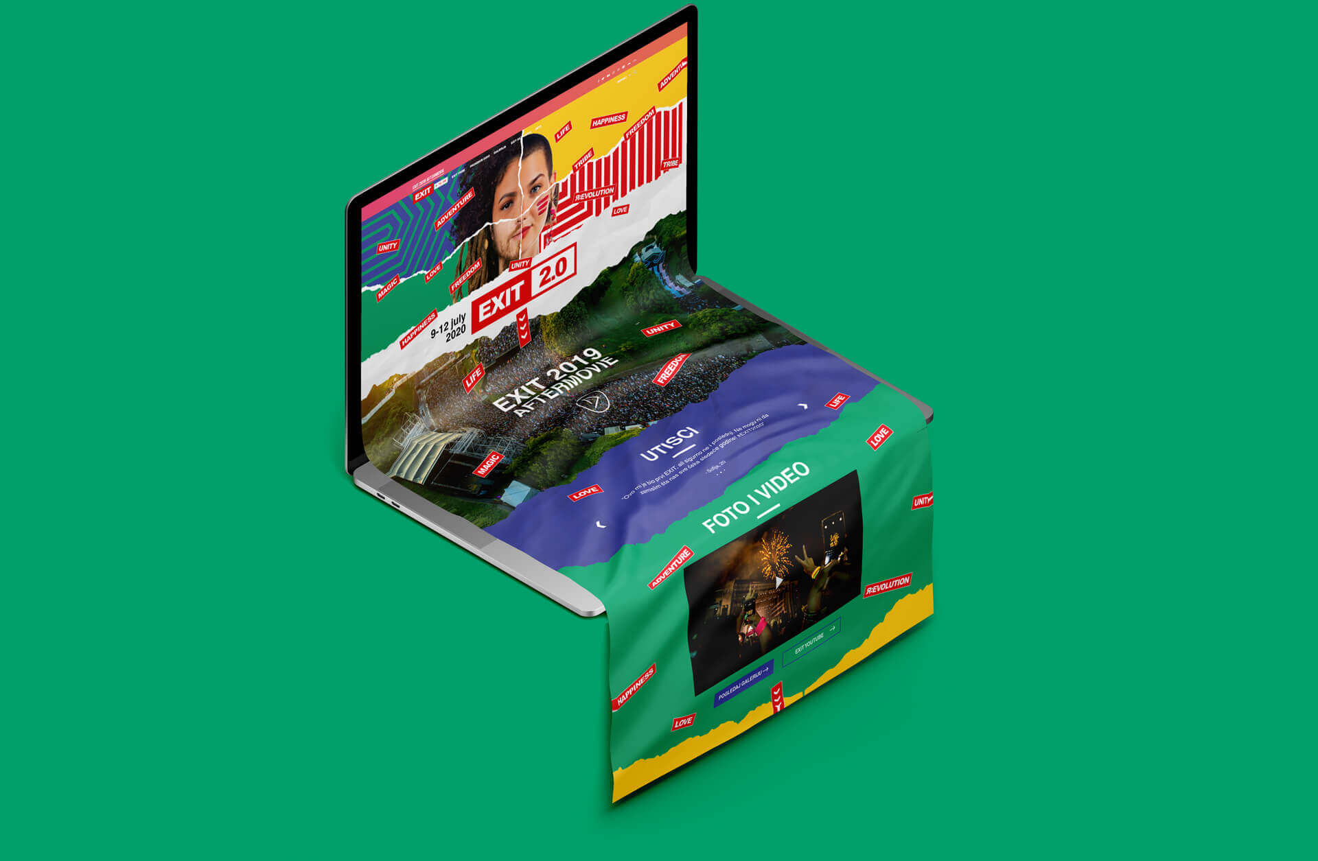
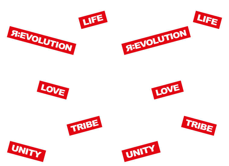
Stickers represent patches for the torn pieces of paper. The whole concept was developed around that idea.
02
Stickers were used significantly in the modern revolutions to make a statement at the time when it was forbidden as a part of rebellion. That’s why we wanted to honor EXIT’s beginnings and its involvement in the political changes in Serbia at the beginning of the 21st century.
03
EXIT logo undeniably looks like a sticker. Right?


Pattern
Play it!
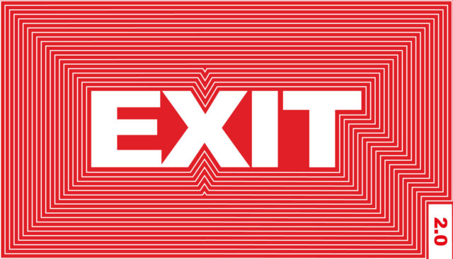
Pattern that we’ve created symbolises the rich history of EXIT Festival. It shows how it grew from year to year. It also simbolises the EXIT feeling that echoes in every visitor’s mind till the next EXIT, probably even longer than that.
On top of that, the pattern follows the shape of Petrovaradin fortress and its arial view.


Key visual
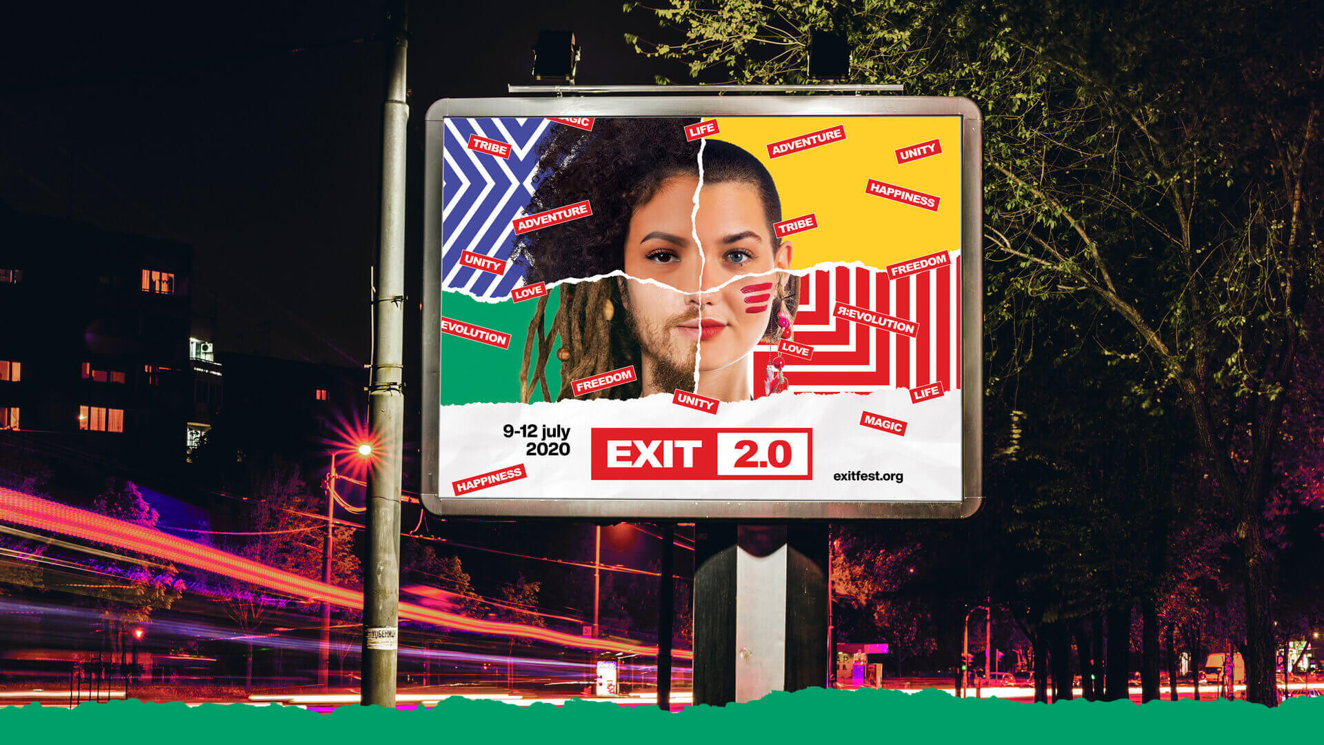
Key visual celebrates unity. It connects four individuals into one. By doing so it shows that despite our differences we are all the same, in the words of Faithless – WE COME ONE!
Play it!
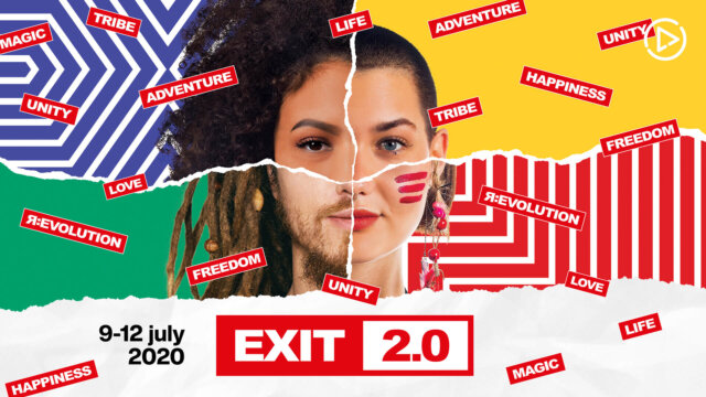
Photo Shoot
The first step in the creation of the key visual was a huge social media campaign to get people to participate and become the face of the EXIT 2.0 key visual…well…at least 1/4 of the face. And boy did they respond! We’ve received thousands of candidates.
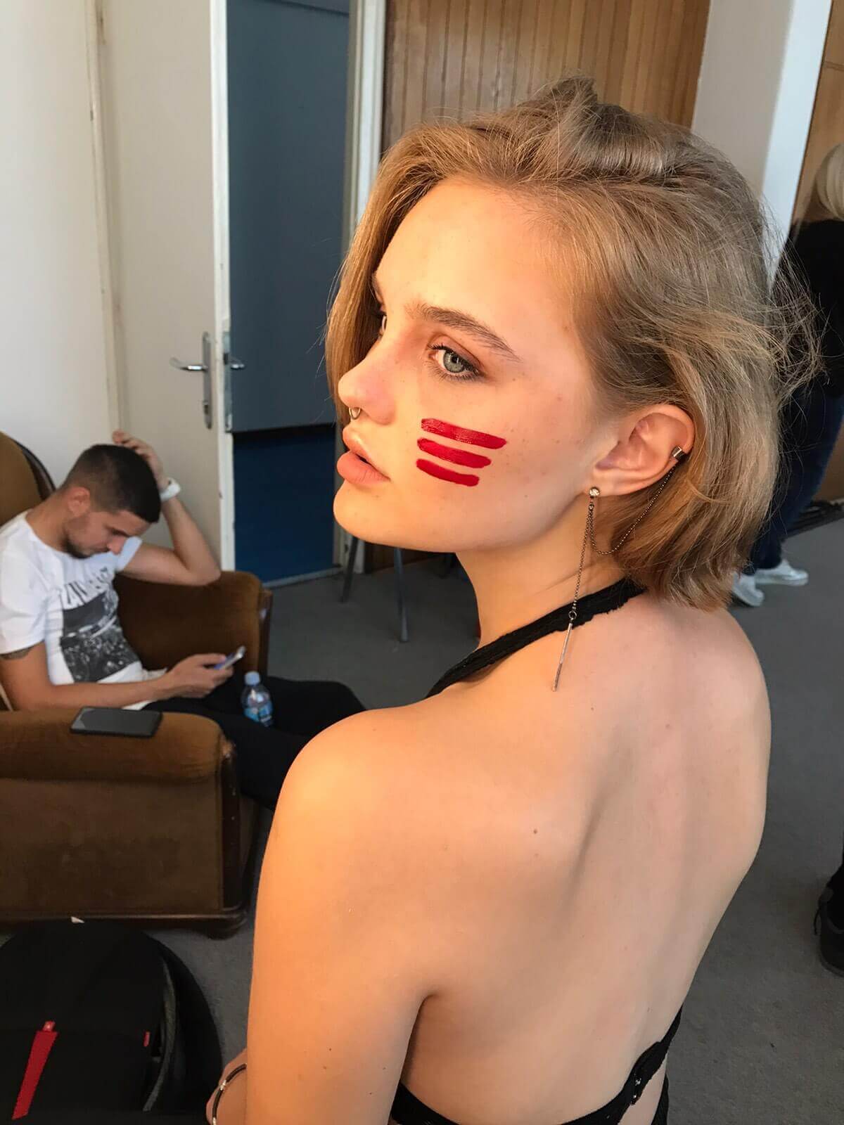

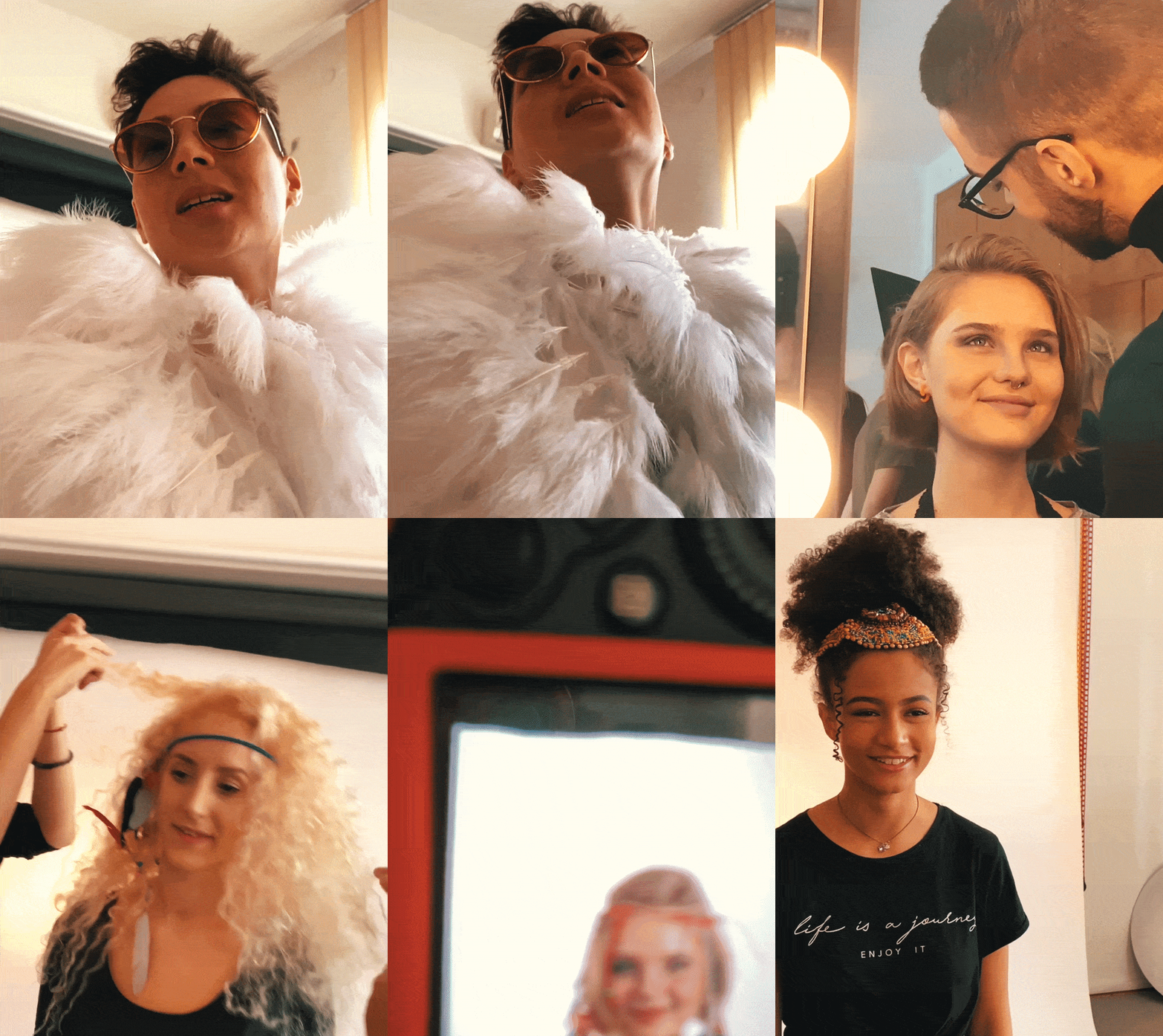
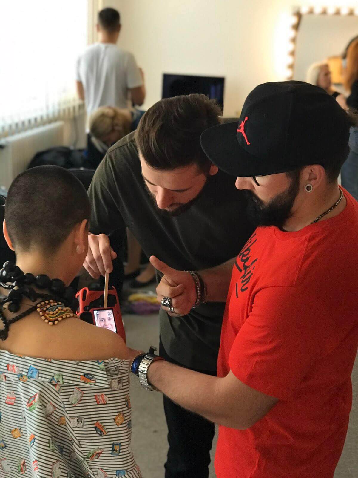
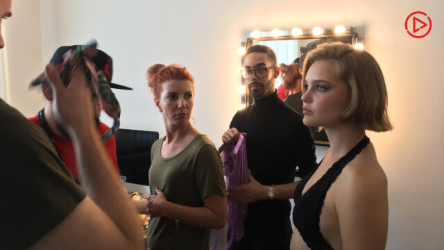
The applicants were from all over Serbia, region and the World. We’ve picked 50 of them and invited them for the photo shoot. The fact that all of them are actually huge fans of the festival only added the value to the whole project. That was a fun day and (we believe) it shows.
Photo shoot – Behind the scenes
Artist Visual
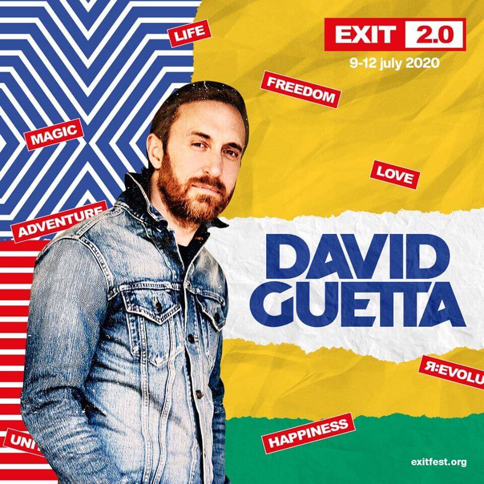
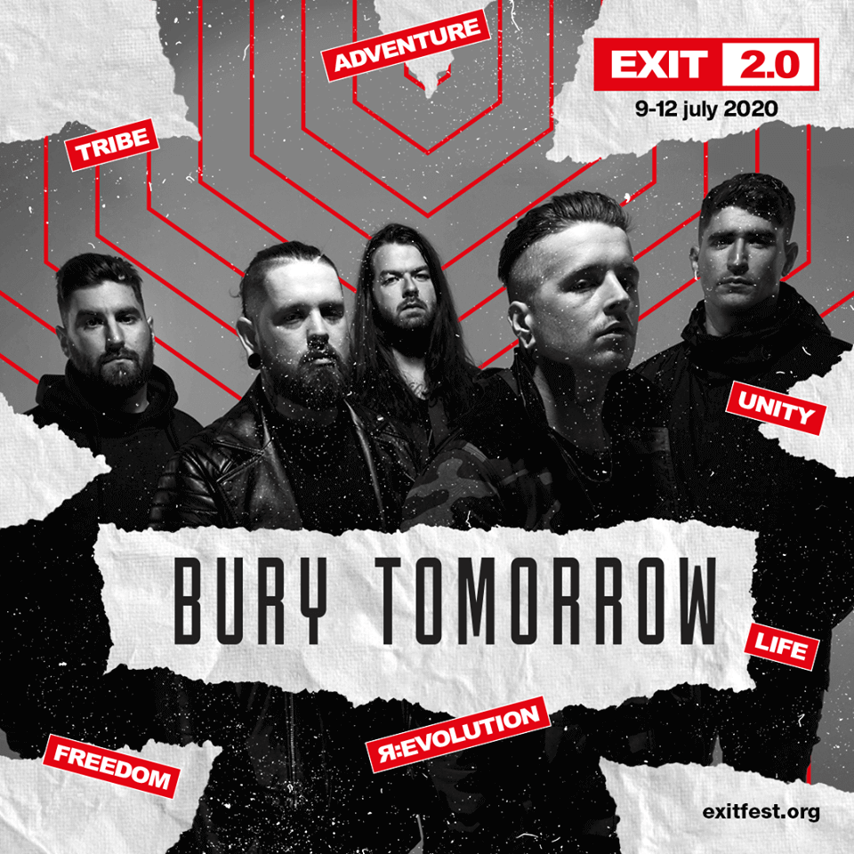
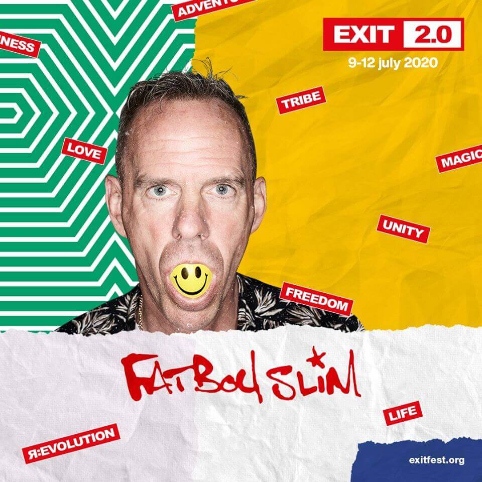
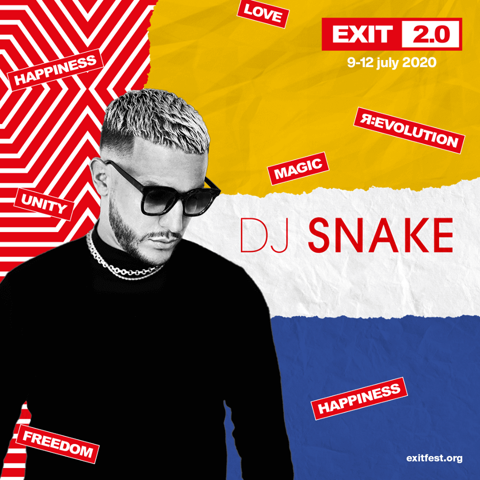
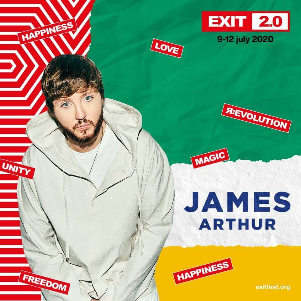
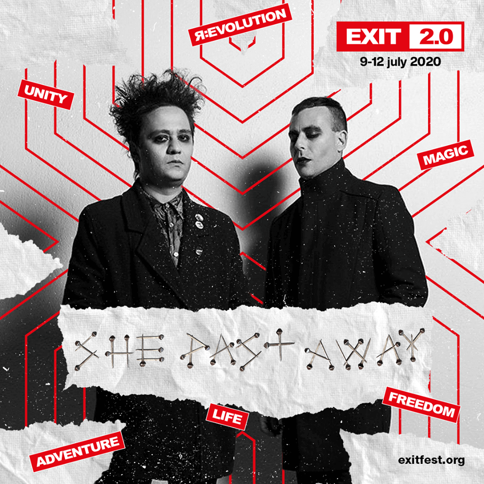
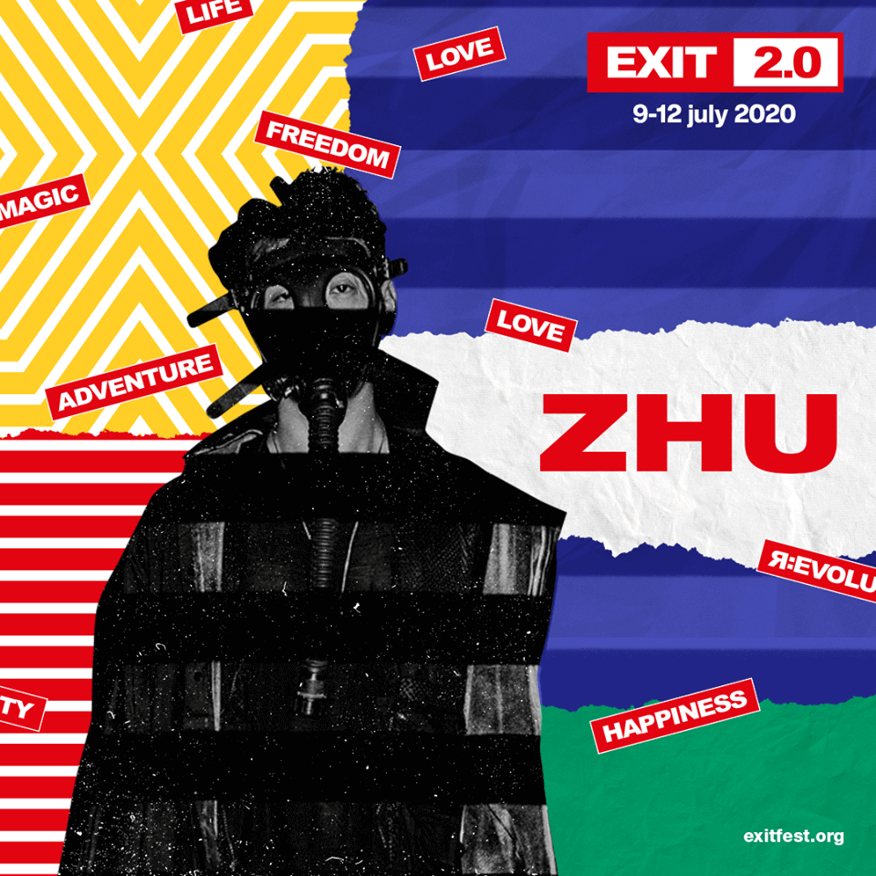
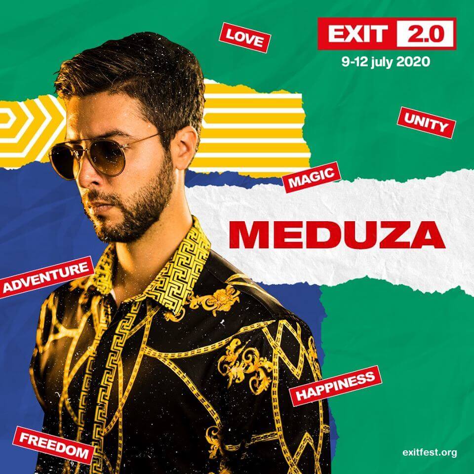
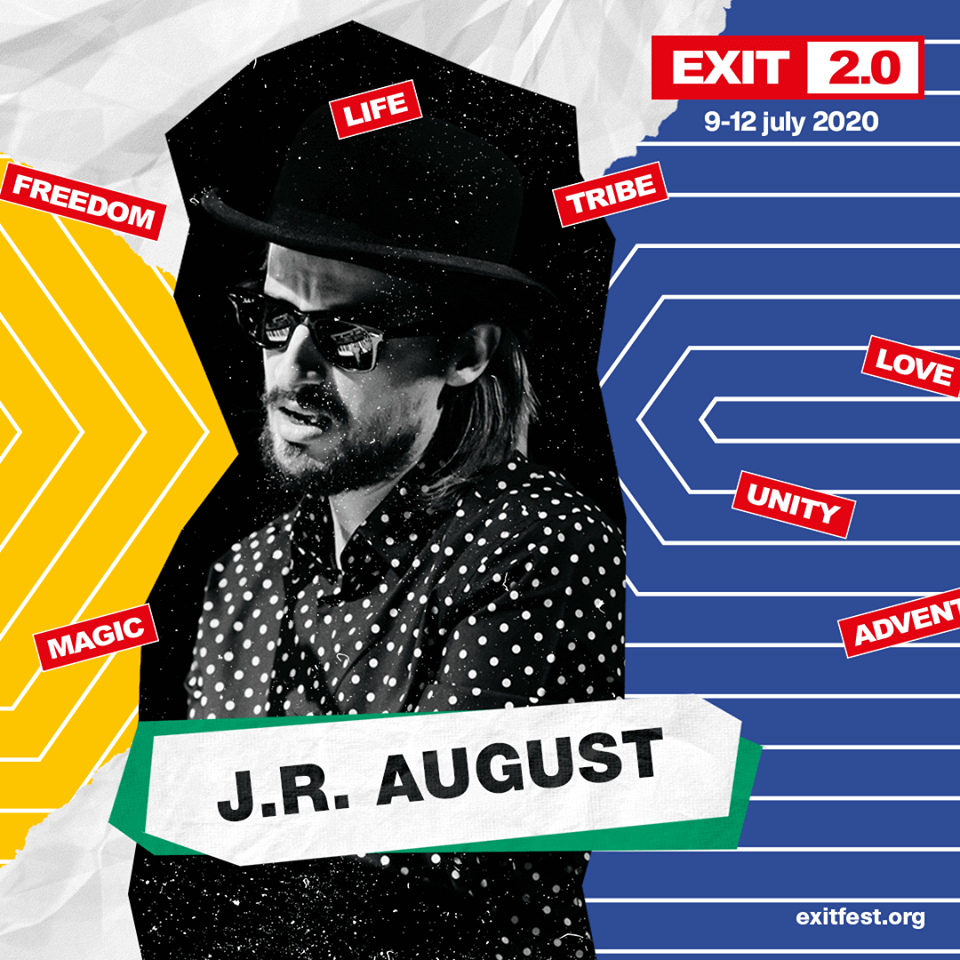
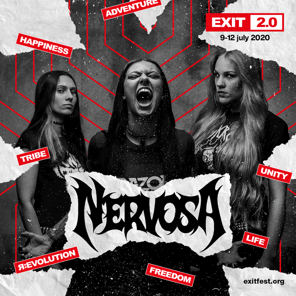
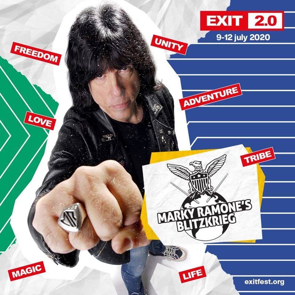
The artist are apostles of piece, love and unity. They erase the differences between people with their music. That is exactly why they are placed carefully as a connecting tissue between torn pieces of paper. Our task was to create four different styles of visual identity for four biggest stages: Main Stage, Dance Arena, Explosive Stage and Fusion Stage.
Like what you see? Let’s talk. Like what you see? Let’s talk.


