Client
City of Novi Sad
Services
Branding
Year
2020
The Story
City of Novi Sad reached out to us thru EXIT to create a campaign for reforestation of the urban areas project. The goal was to create greener, healthier and nicer Novi Sad.
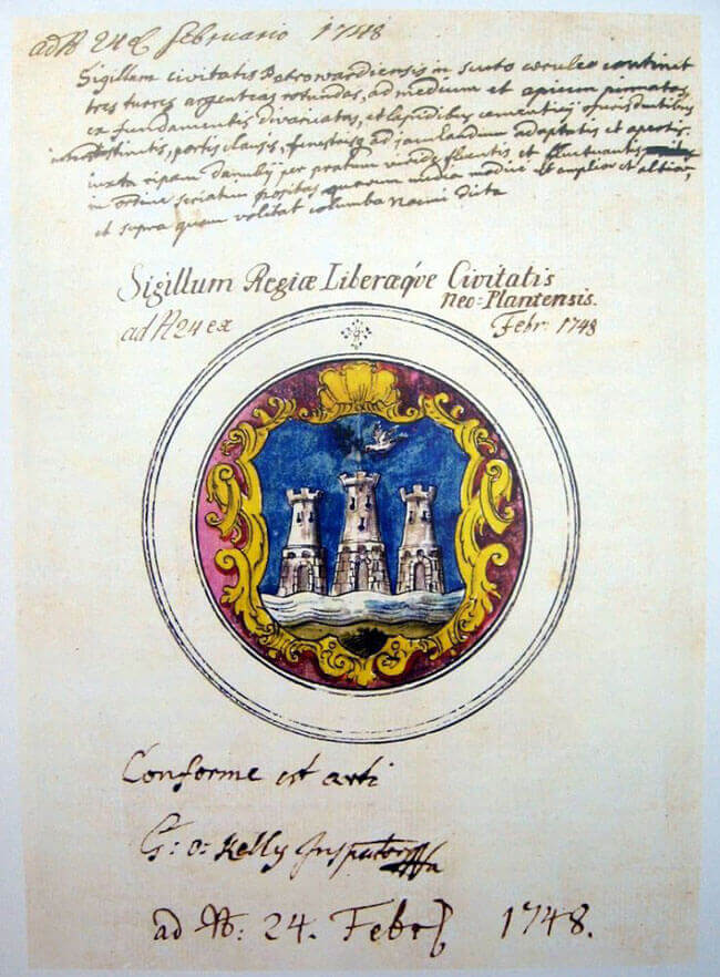
From the written documents we find out that Maria Teresa named Novi Sad in 1748. That year it was named “Neoplanta” and the order was given to translate it in the imperial charter. The Serbian name was novi sad, nova plantaža or novi zasad.
It was named like that because the area was devastated by wars so it symbolises the new growth, new life.
We found the idea for the visual identity in its name (Novi Sad, Novi Zasad). We wanted to keep it simple but above all, we wanted it to be smart.
Key Visual
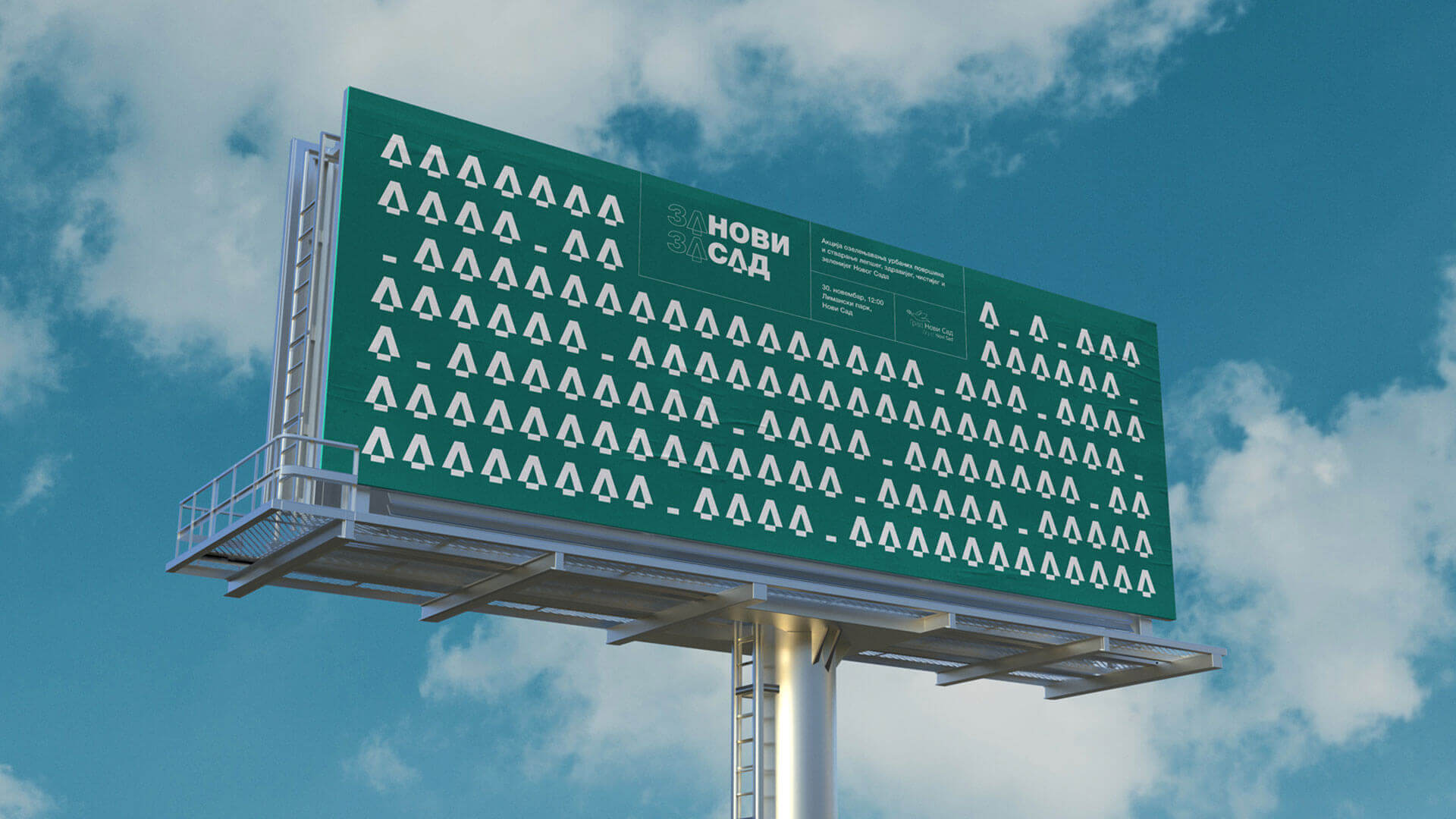
The name of the campaign we came up with is (Re)New (Re)Seed. It works better in native Serbian because it has a name Novi Sad implemented. Catchy name that serves perfect as catch phrase as well. In our book it checked all the boxes.

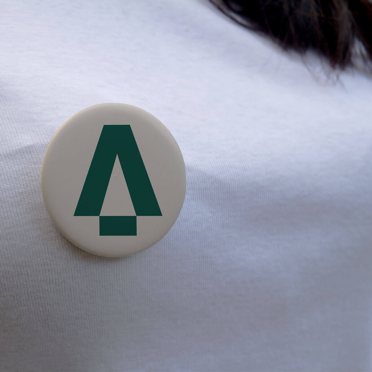
The main element is as simple as it could be, letter A from the word ZA. We’ve modified it simply by dropping down the horizontal line (as illustrated on the left). Horizontal line represents the seed being planted into the soil and also the letter looks like a tree. Smart, right?

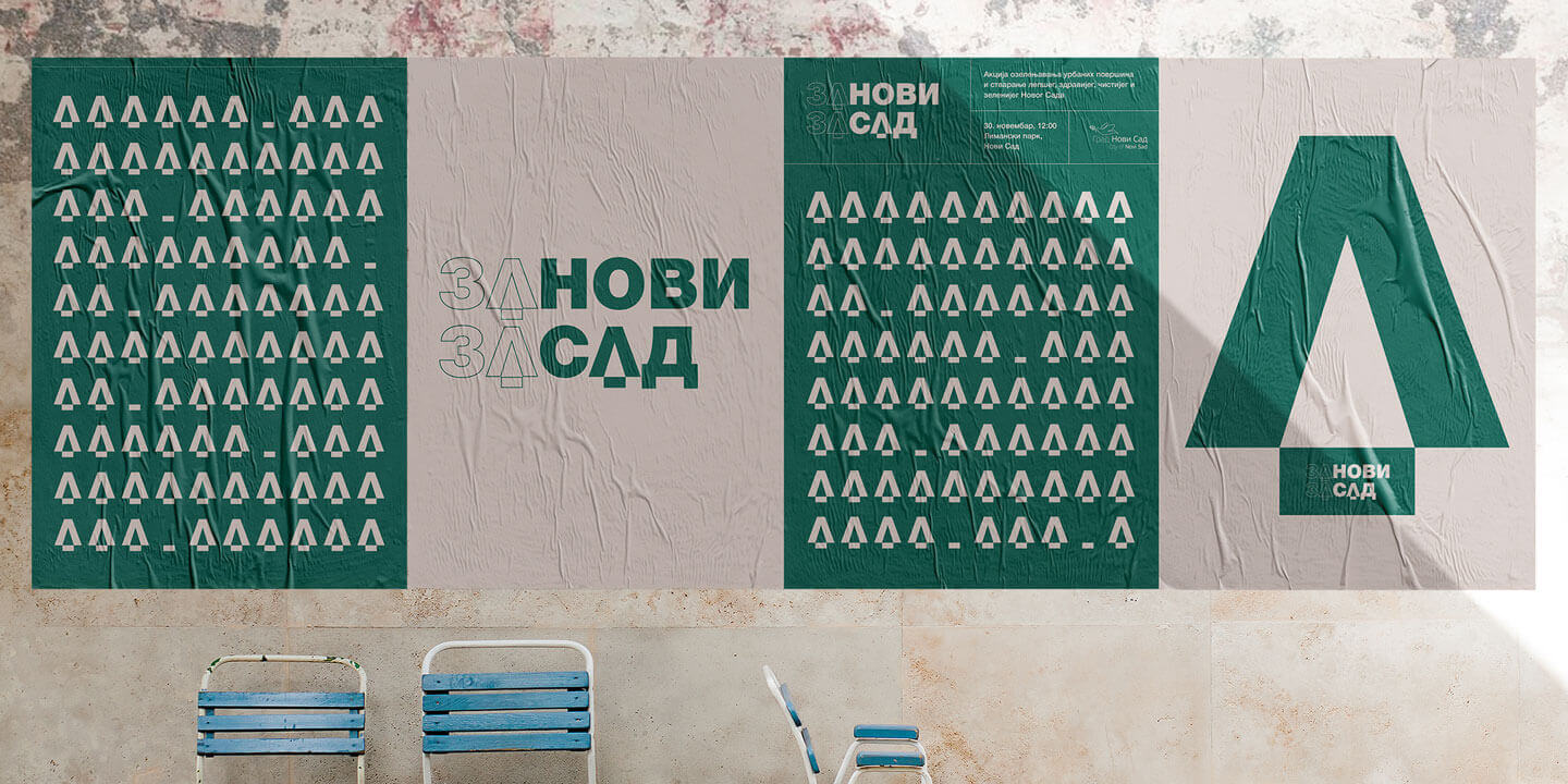
Posters
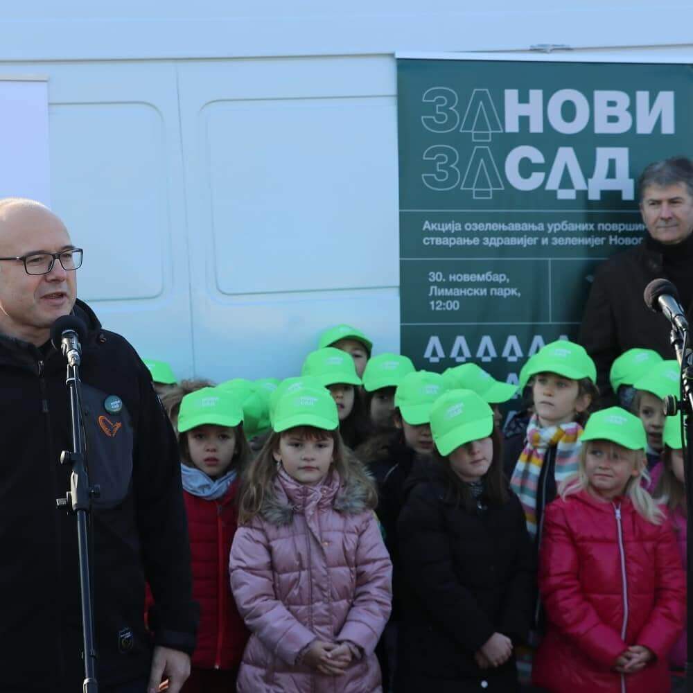
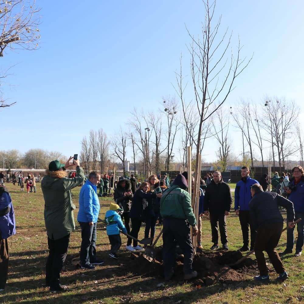
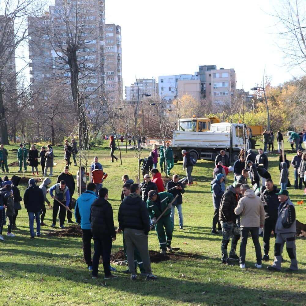
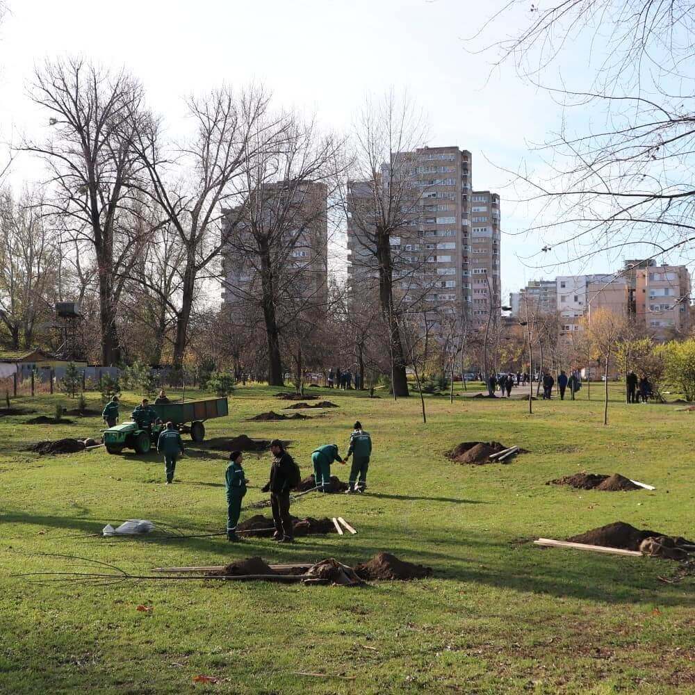
Photos from the event
T-shirts


