Client
IT-Tel
Services
Branding, Photo, Web
Year
2018 – ongoing
The Story
IT-Tel is the construction company from Belgrade, Serbia. They represent the team of experienced professionals with expertise in construction, installation works, and finishing interior works.
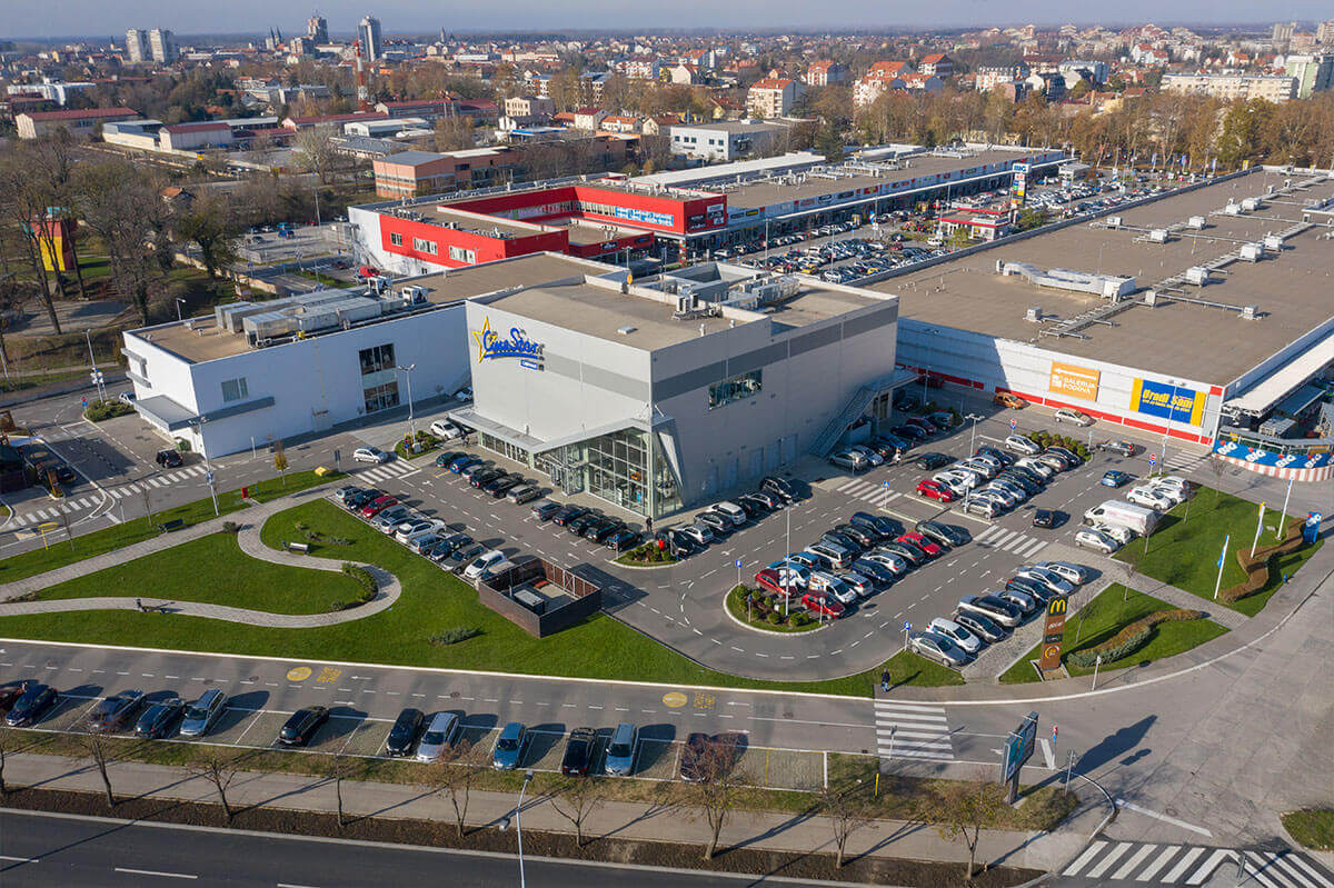
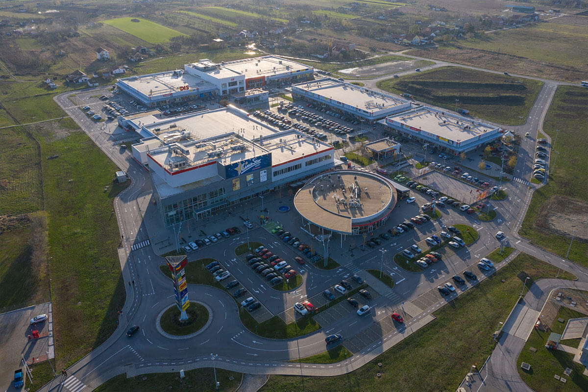
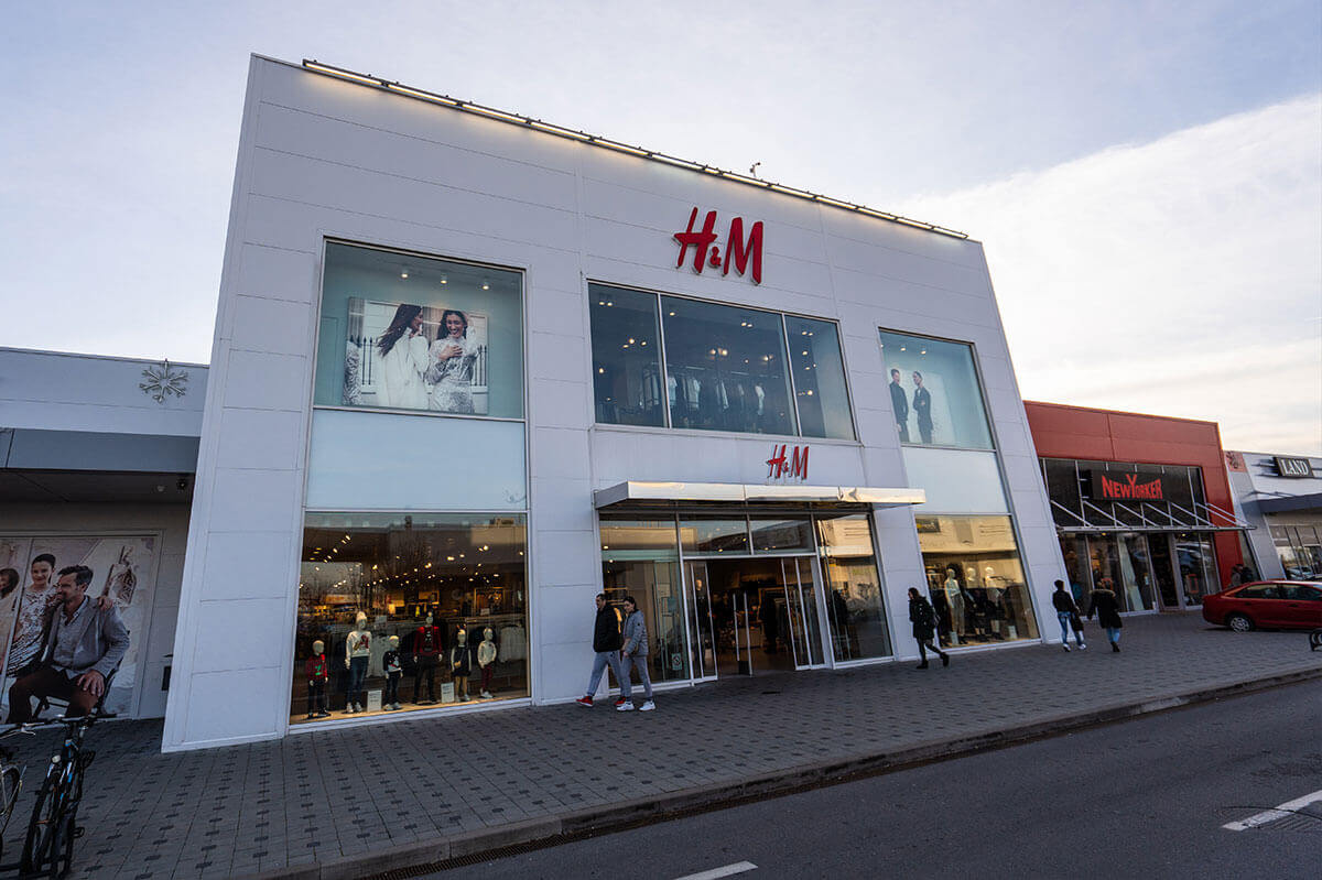
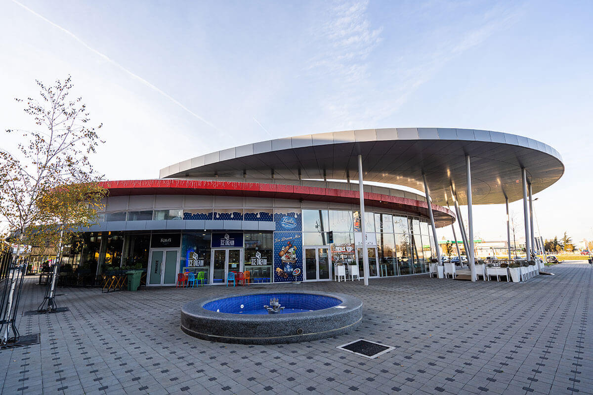
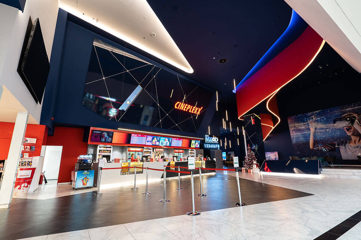
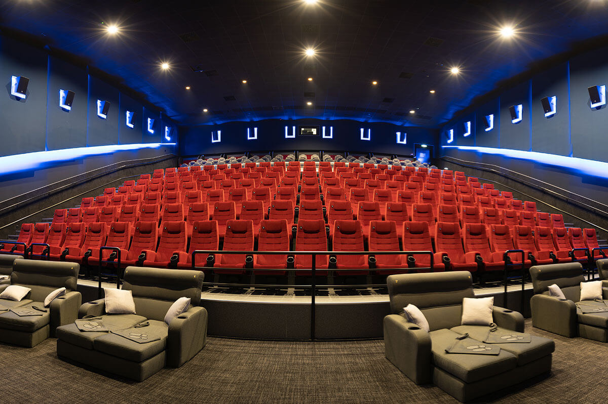
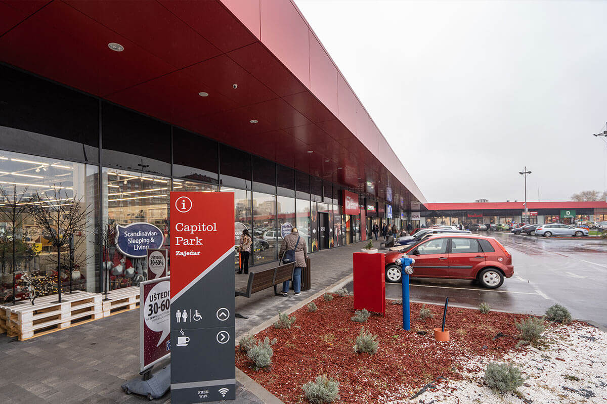
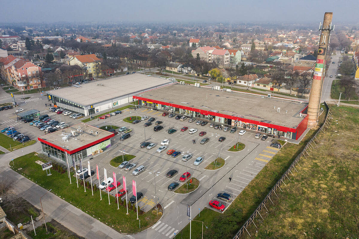
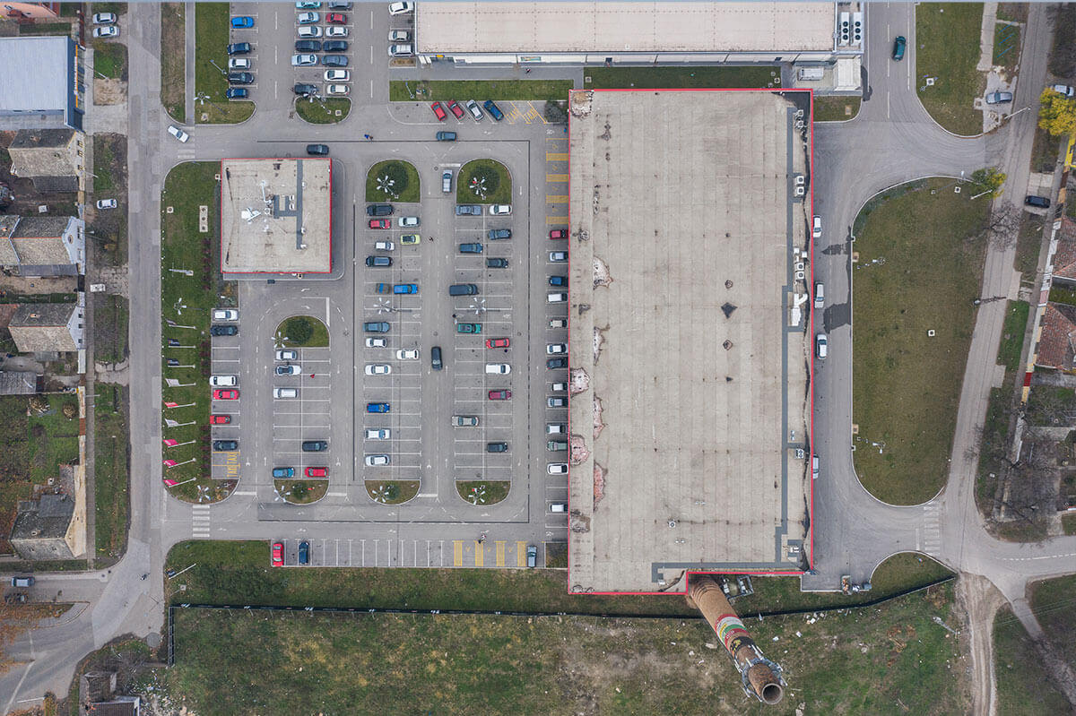
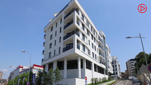
We were approached to create the elements for their visual identity. The client wanted the modern design with the strong association to construction industry. After successful completion of that phase, the next phase was reference photo shoot and the website. The photo shoot was demanding because our photographer had to visit 20 locations all across Serbia. Here’s the selection to give you a little taste.
Video
Website
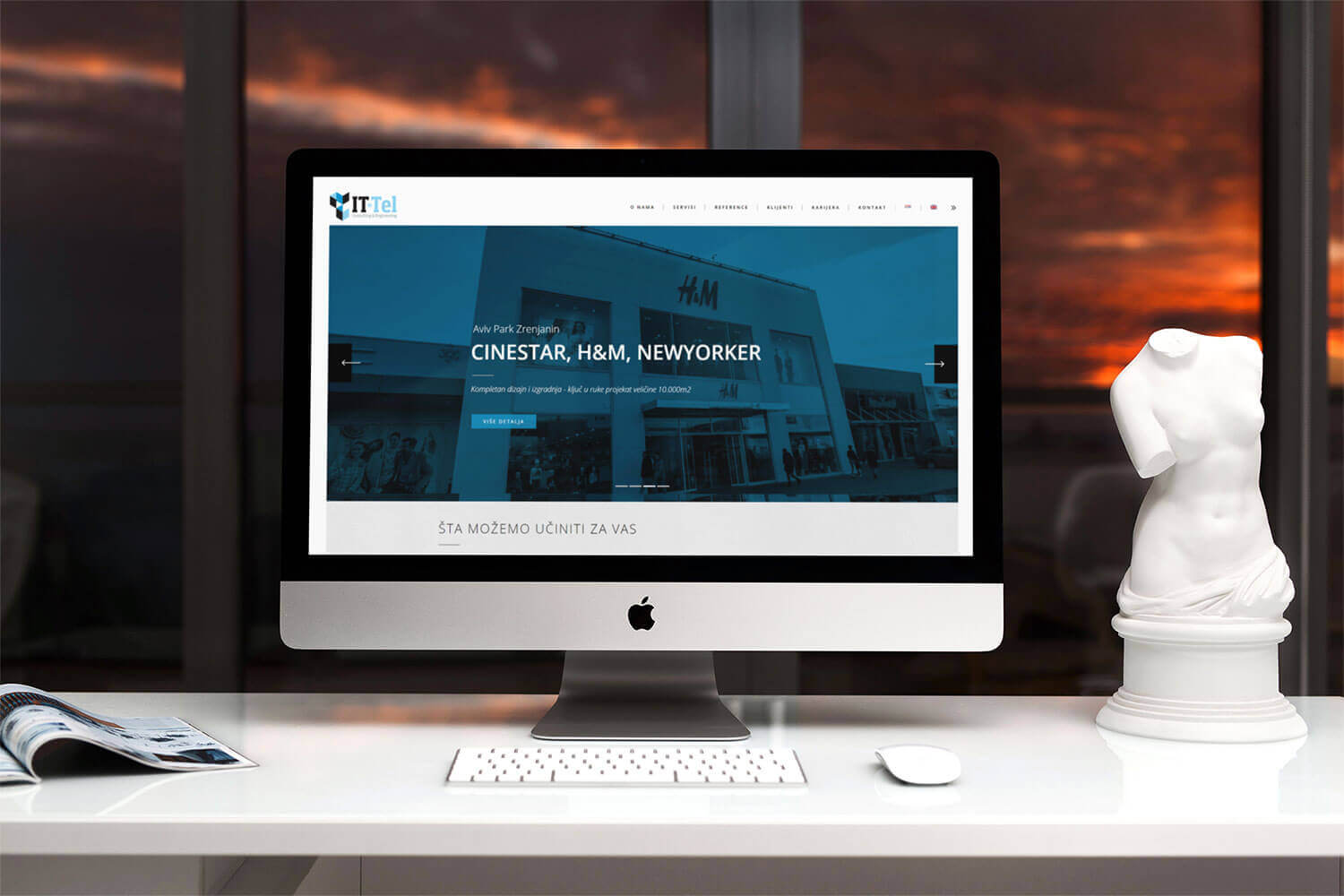
Before we proceeded to the production of the website, the client gave us a list of different companies from their field. We’ve noticed that all of them had a similar approach so we wanted a different style. Our concept is clean and stylish, but above all user friendly.
Responsive Design
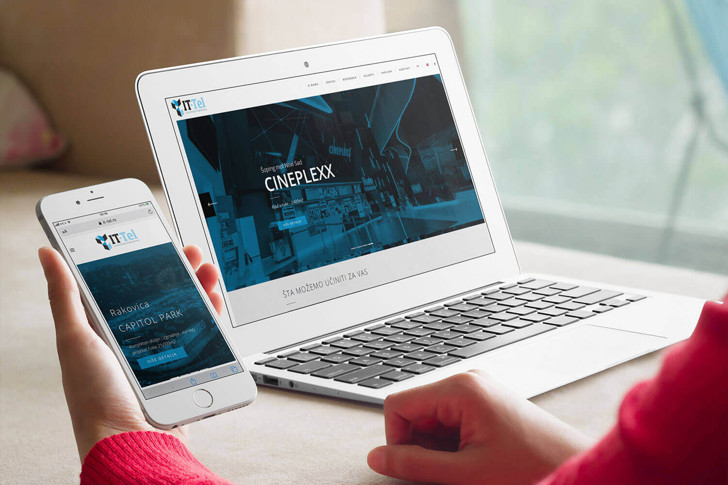
It goes without saying that all of our websites are designed with different platforms on mind. We pay a lot of attention to the user experience and visual continuity on all of the platforms (desktop, laptop, tablet and phone).
Logo & Stationary
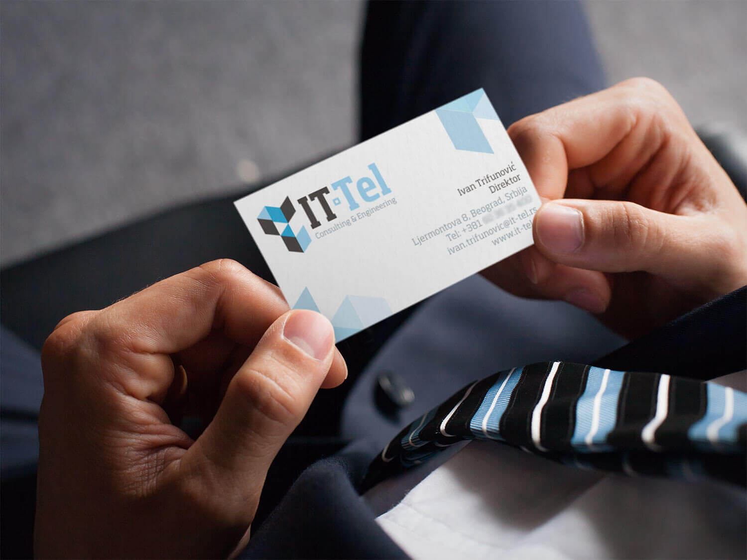
The icon in the logo is literally made of stylised building blocks. What better element to use for the construction company? Typography has a resemblance to construction beams and cranes. The whole “building block” element is implemented into the stationary.
“Thru dedication and professionalism, efficient communication and unique design, Blu Creative Studio made sure that work they did for us was up to the highest standards. Their work reflects every aspect of our company and highlights everything that needed to be highlighted. We couldn’t be happier and couldn’t begin to recommend their services.”
Ivan Trifunović
General Manager
Like what you see? Let’s talk. Like what you see? Let’s talk.


