Client
Stara Sokolova
Services
Branding, Photo, Web
Year
2016 – ongoing
The Story
Stara Sokolova is award winning brand of high quality rakija (brandy). Based on the family secrets of rakija distillation and aging, in cooperation with the most prominent experts in this field, Bogdanović family has been cherishing and improving their centuries long know how in producing fruit brandies.
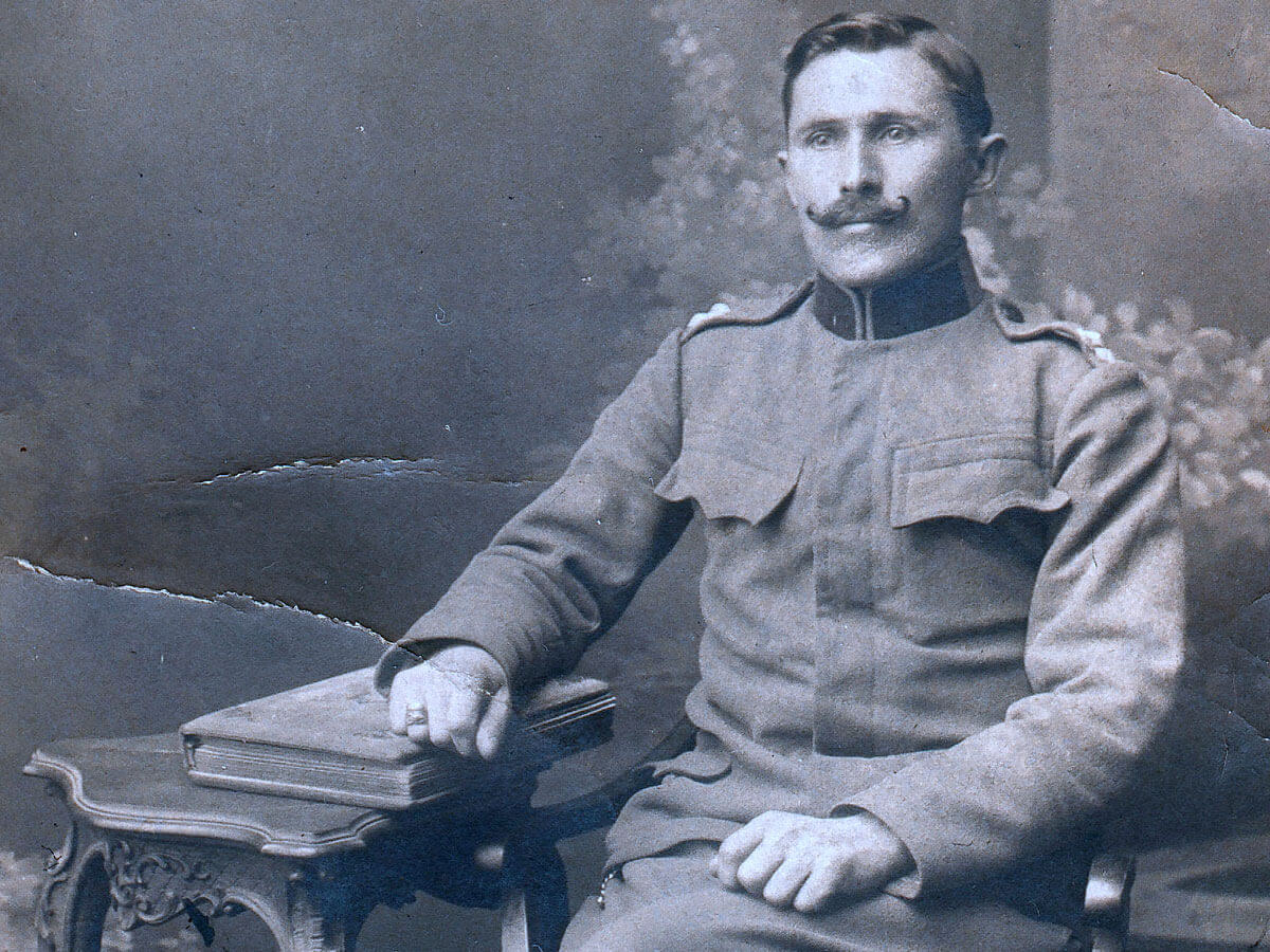
Our studio was hired to create one of the kind packaging design for their limited edition series: Peach and Quince. We were impressed with their centuries old tradition and just had to make that the focal point of our design approach. With their help we dug up loads of old photos and stories. It helped us get the true sense of who they are.
Stara Sokolova: Peach & Quince (Limited Edition)
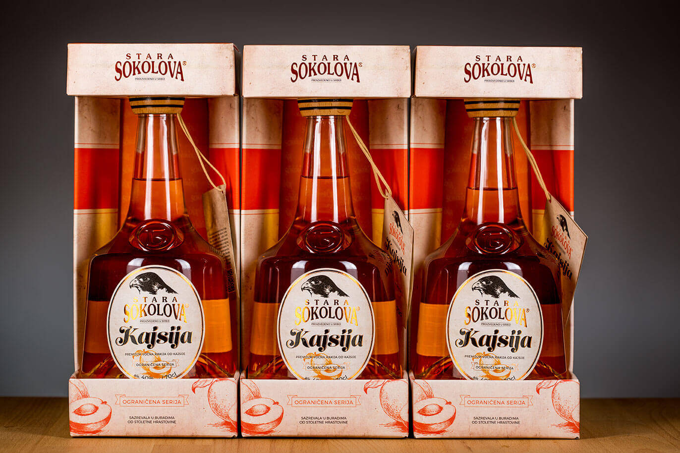
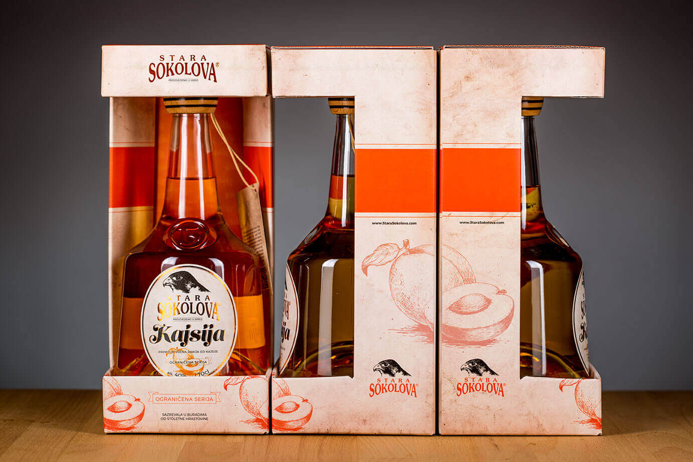
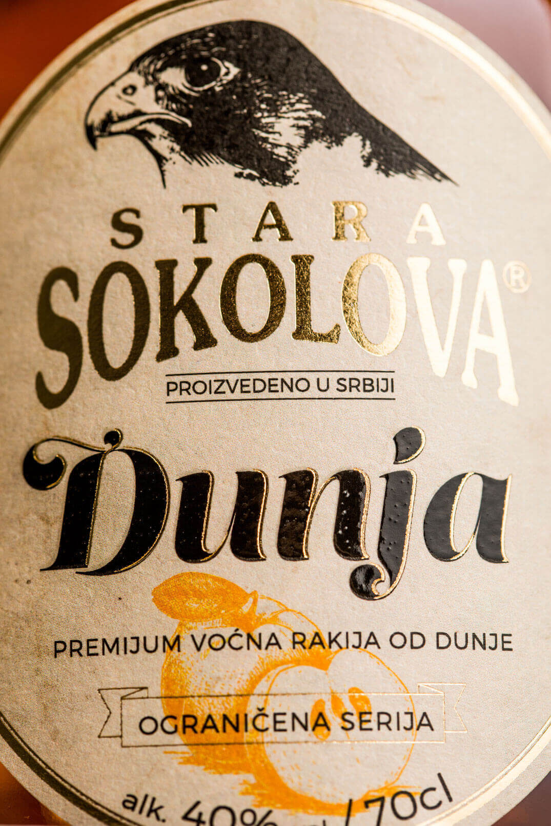
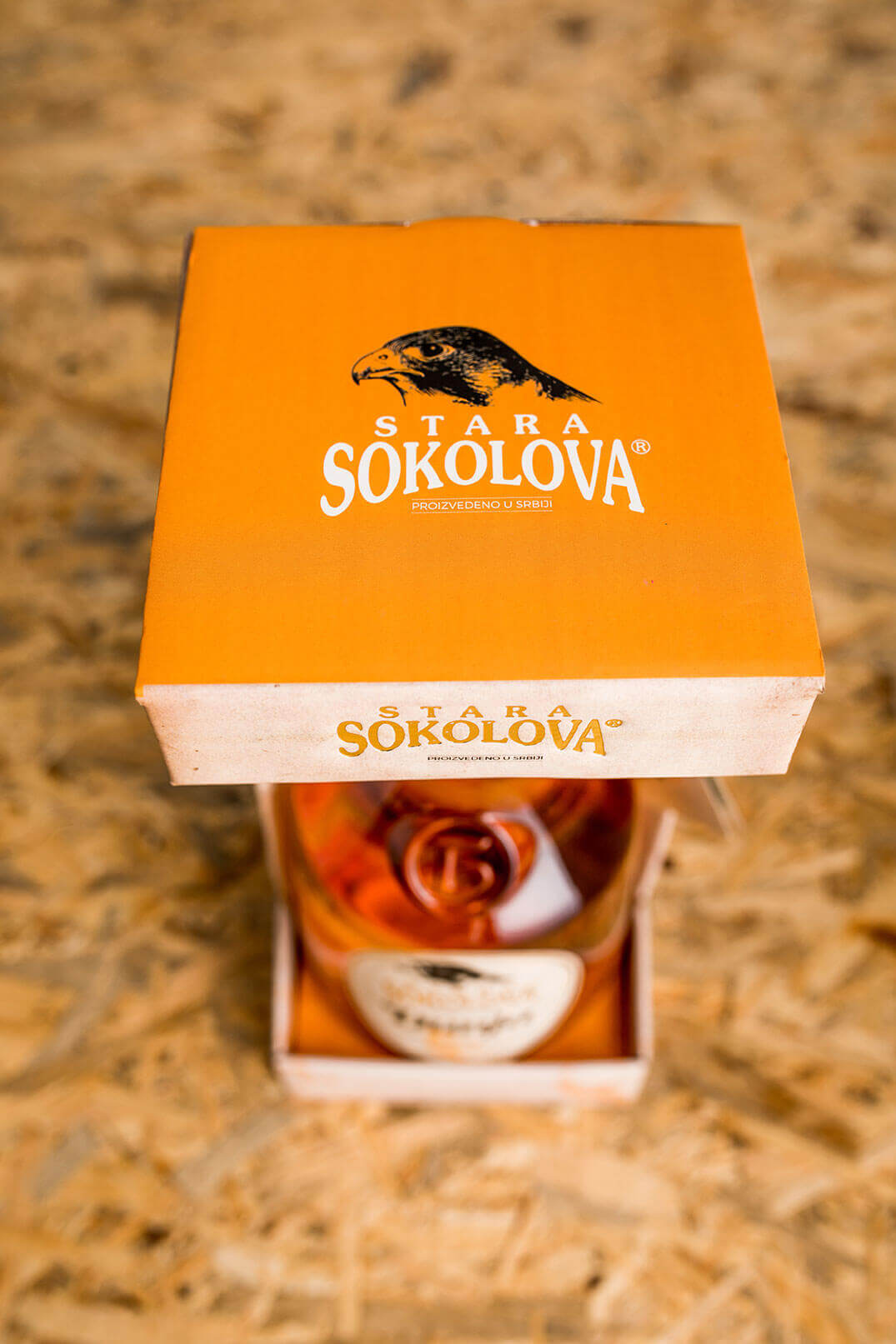
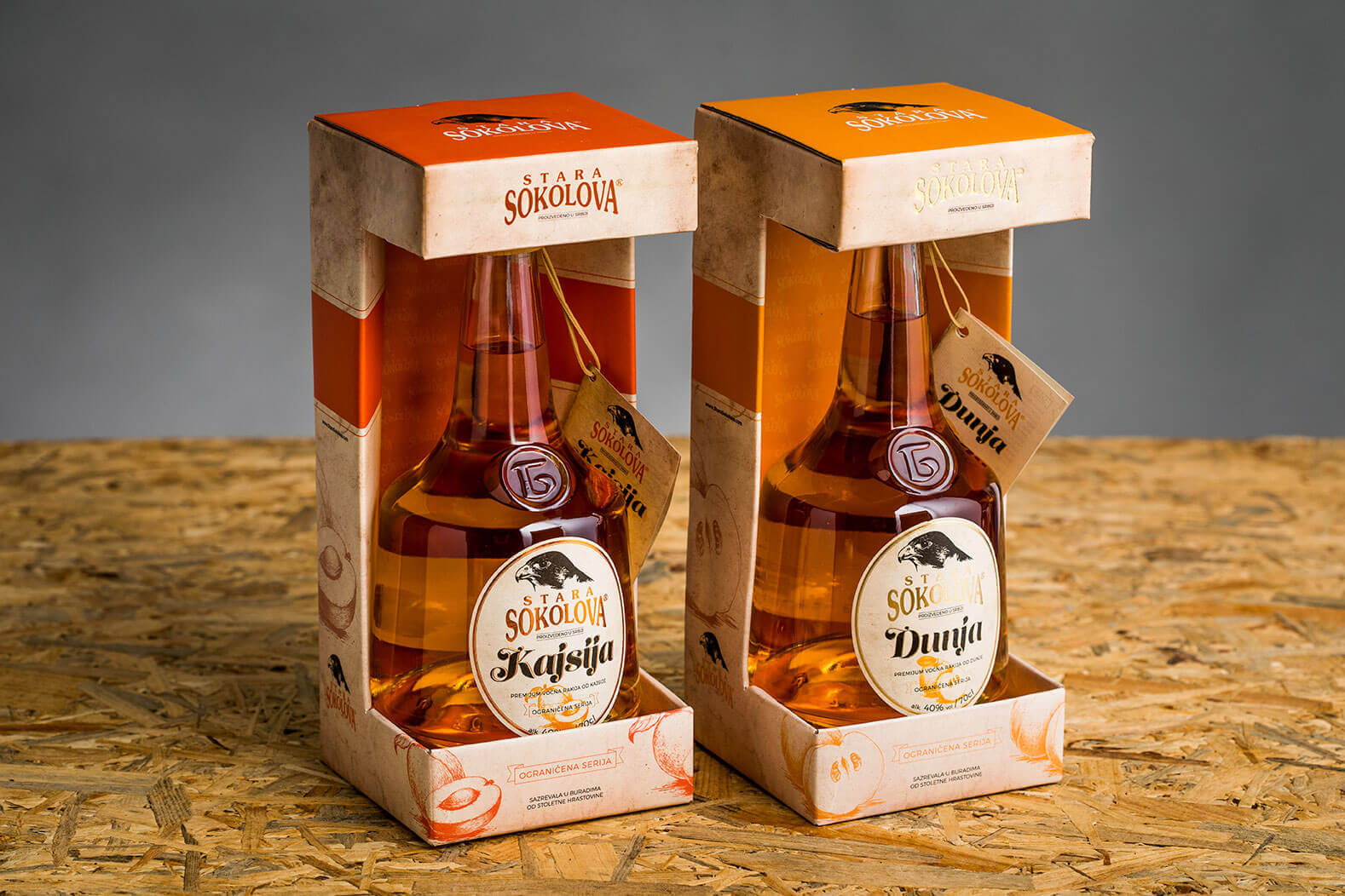
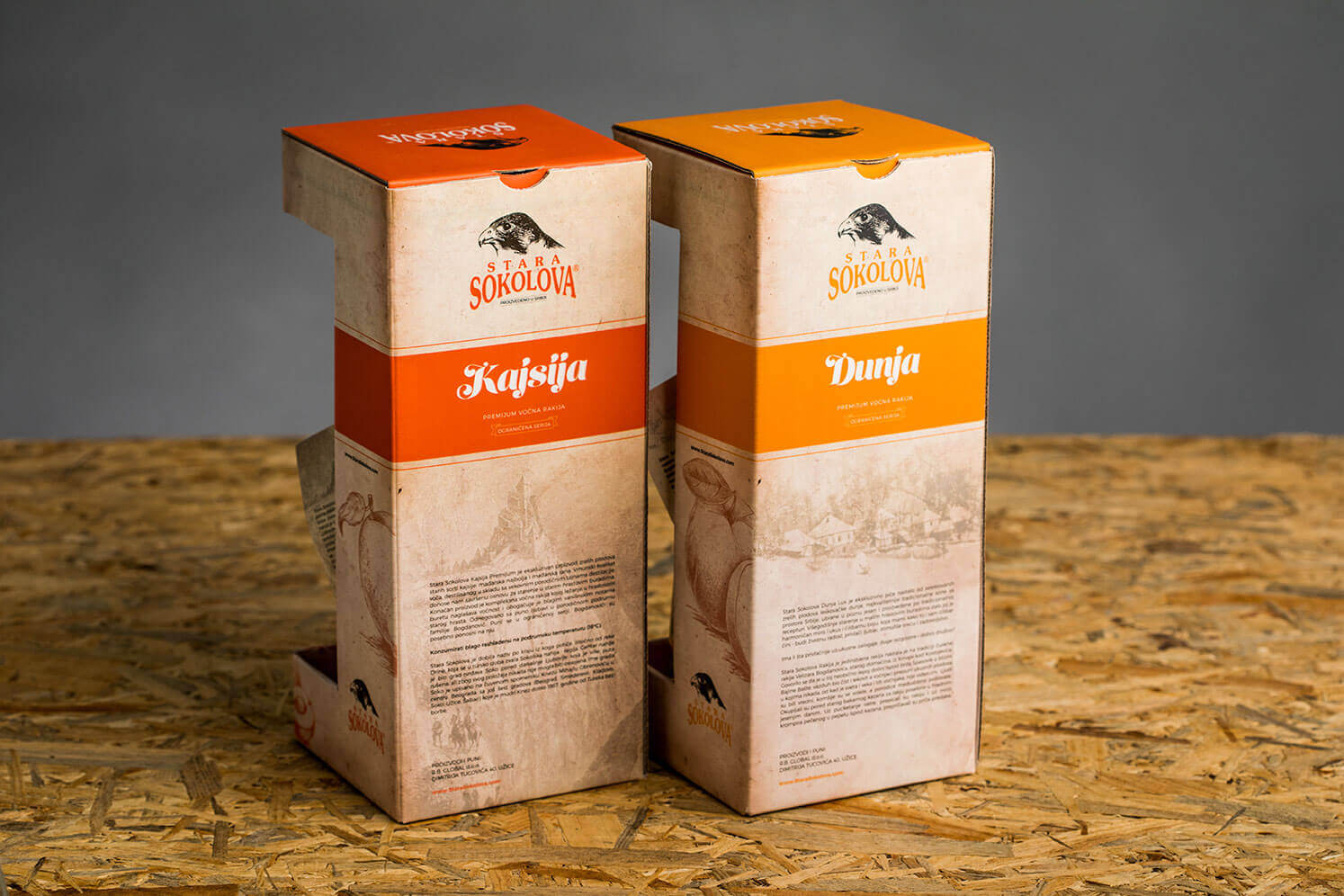
This was our first bottle created for Stara Sokolova and it set the tone for the entire series. We were going for the old, vintage feel with tradition on our mind. Old worn-out paper as a background, hand drawn elements, historical facts on the back of the box.
We wanted to highlight a few elements: first of all, the peach flavour, the fact that it is limited edition with only 800 bottles per year and that it’s produced and bottled in Serbia.
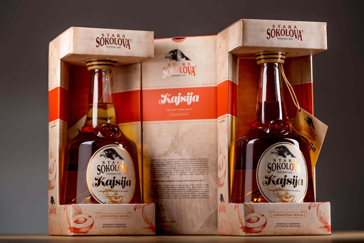
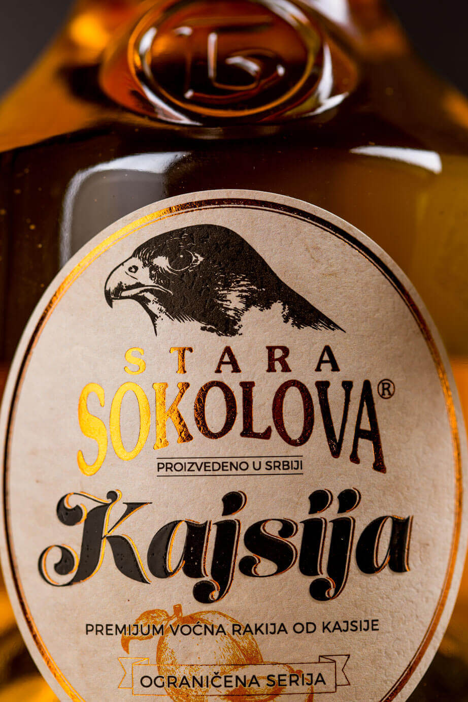
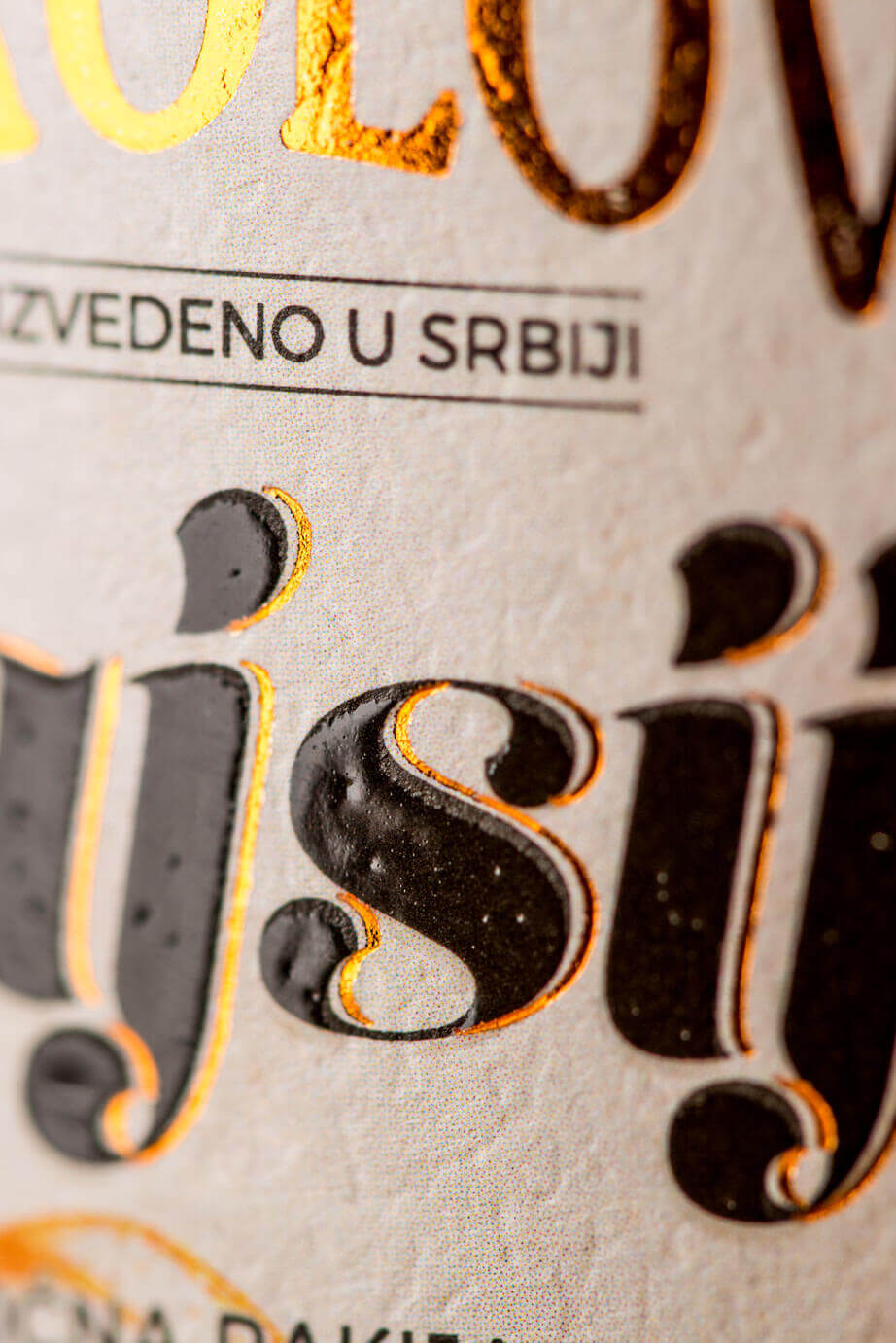
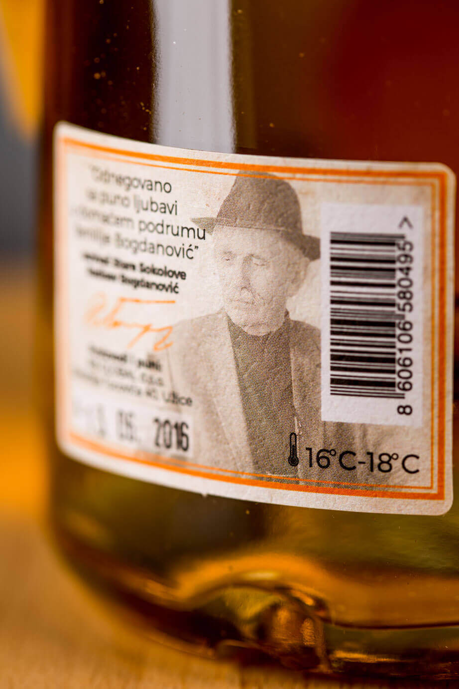
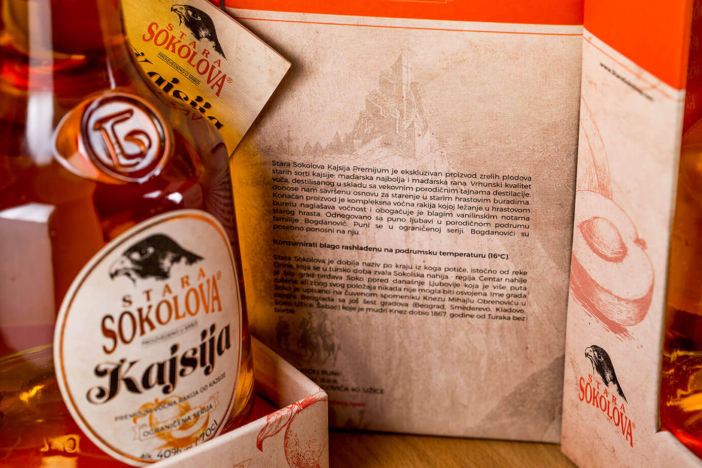
We payed a lot of attention on how the boxes will look once placed on the display. That is why we did continuous design. No matter how you turn the box (front to front, side to side or back to back), it will always look perfectly matched.

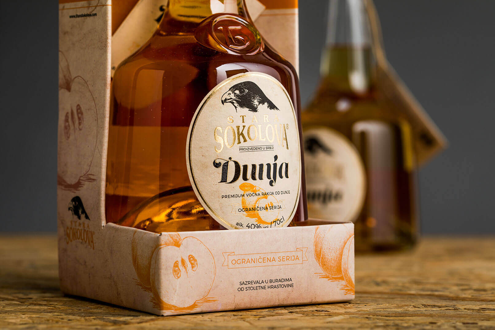
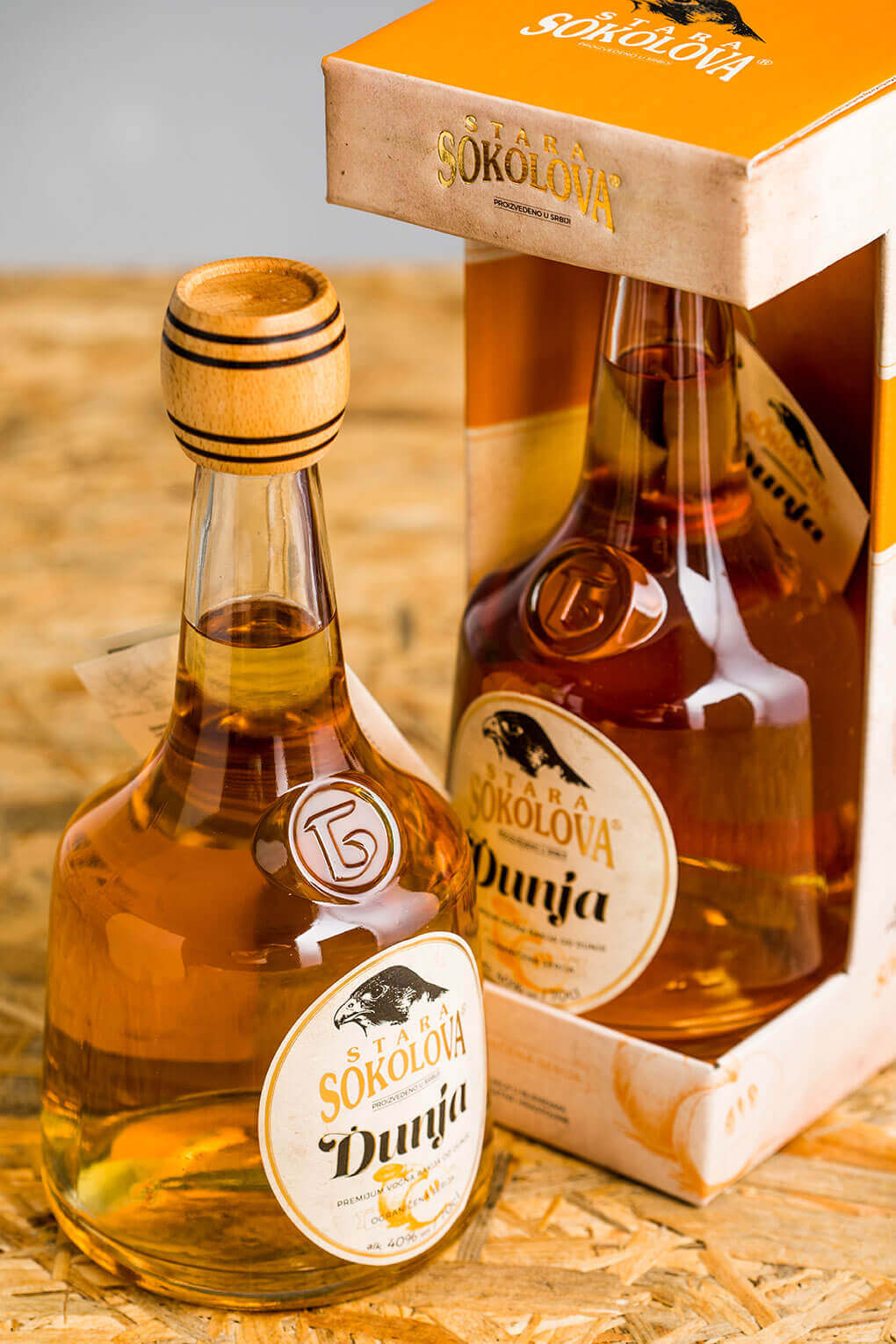
The second product of the series is the quince rakoja. It follows the tone set by the peach rakija. The idea was to make it look similar yet distinctive enough. In order to achieve that we’ve used a different color, different illustration and a different story on the back of the box.
It was really important that both peach and quince are unmistakably from the same series.

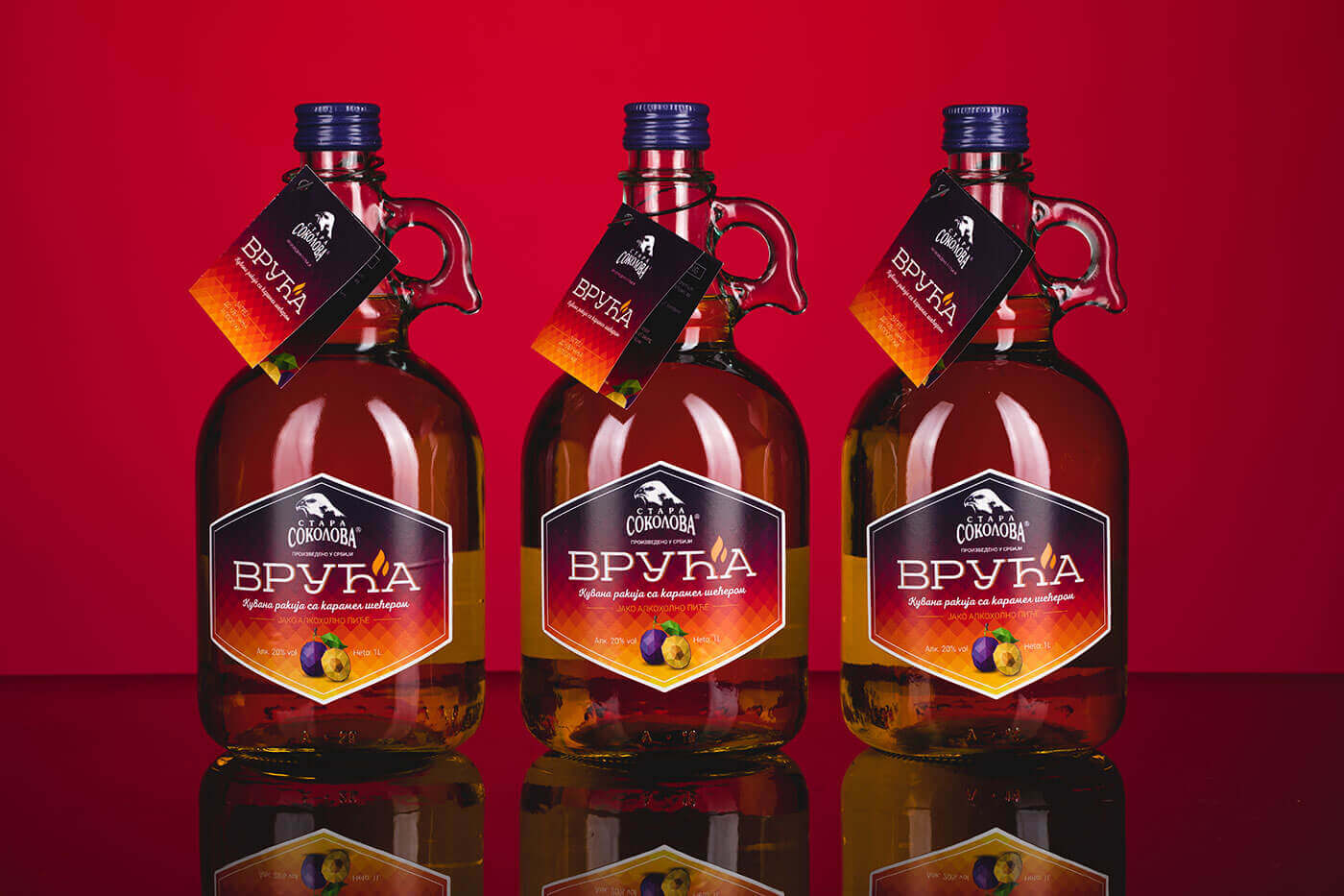
Vruća
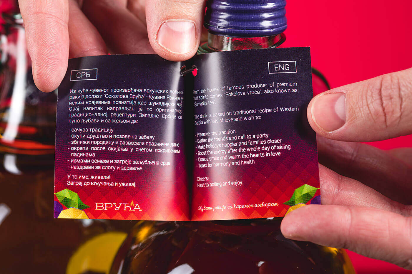
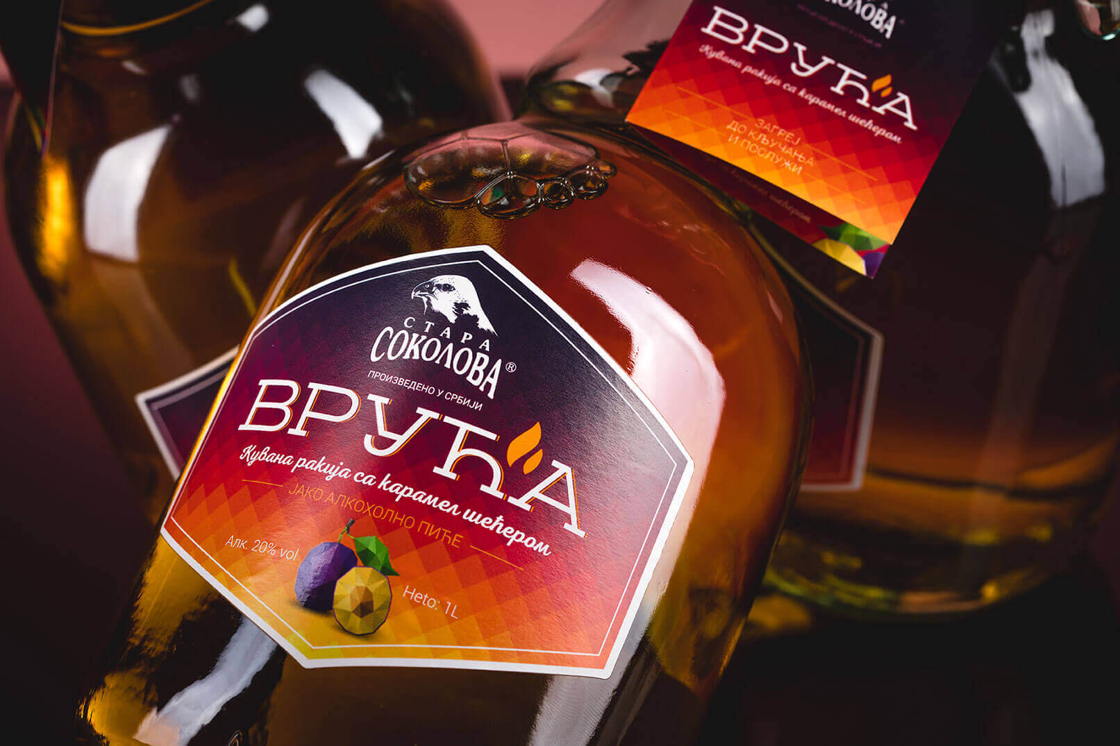
People in Serbia traditionally cook their rakija but you have to know how to make it. “Vruća” (translated to english – “Hot”) is interesting product because it is pre-cooked. It is created to have an appeal to younger people that live in the city and don’t necessary know how to cook it.
Our task was to create youthful, cool design that associates with the fire and heat.
